 Get Halloween 15% for Limited Time on Lifetime & Bundle Deal

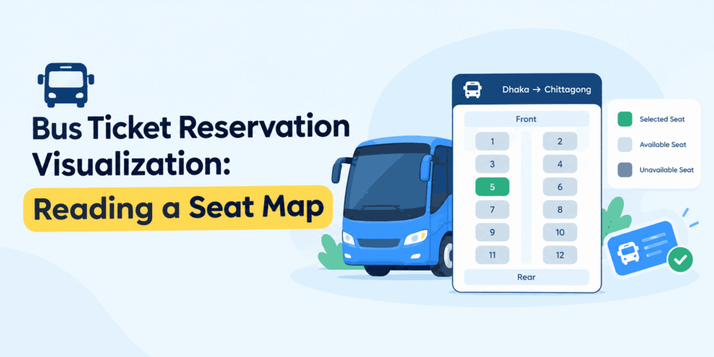
Bus ticket reservation visualization is what a passenger sees between choosing a trip and paying for it: a visual map of the vehicle showing which seats are free, which are held, and which are already sold. When that visualization is accurate and quick to read, passengers pick a seat with confidence and finish the booking. When it is vague, they second-guess, abandon the cart, or call support to ask what the picture actually means.
This guide explains what a reservation visualization should show, how the parts fit together technically, and how to judge whether the one on your booking site is doing its job.
- What Bus Ticket Reservation Visualization Actually Means
- Why Visualization Decides Whether the Booking Completes
- What a Good Seat Map Should Show
- How the Visualization Fits Into the Booking Flow
- Assessing Reservation Visualization in Bus Ticket Software
- Common Visualization Mistakes and How to Avoid Them
- Designing the Visualization for Different Operators
- Verifying That the Visualization Actually Works
- Frequently Asked Questions
- Final Thoughts
What Bus Ticket Reservation Visualization Actually Means
The term covers every visual or interactive element that turns a seat inventory into something a passenger can understand at a glance. In practice, that usually means four things working together:
- A seat map — a scaled layout of the coach, drawn row by row, with each seat rendered as its own selectable element.
- Live seat status — each seat labelled as available, booked, on hold, or blocked, refreshed as other passengers buy.
- Trip and pricing context — the departure time, boarding point, coach type, and fare attached to the seat being viewed.
- Booking feedback — a clear visual confirmation of the seats selected, the boarding point, and the total before payment.
Visualization is not decoration. It is the interface where inventory, pricing rules, and passenger decisions meet. A booking plugin can hold perfect inventory data and still lose the sale if the passenger cannot tell which seats are still open.
Why Visualization Decides Whether the Booking Completes
Passengers on a bus route usually have a strong preference: window or aisle, front or back, upper or lower deck, night or day side. They express that preference by tapping, not by reading a table. Three things follow from that.
First, seat selection replaces guesswork. Instead of booking an unspecified seat and hoping, the passenger sees exactly what they are buying, which reduces post-booking complaints and refund requests.
Second, accurate visual status prevents double-selling. If two shoppers open the same trip, the map must show a held seat as unavailable the moment one of them reaches checkout. Visual clarity here is the front end of a locking mechanism, not just a convenience.
Third, clear visuals lower support load. Every question of the form “which seat did I get?” or “is the upper deck full?” is a call or message that a well-designed map answers before it is asked.
If you want the broader commercial case for moving reservations online, the advantages are laid out in this guide to online bus ticket reservation benefits — this article stays focused on the visualization layer itself.
What a Good Seat Map Should Show
1. The Real Physical Layout
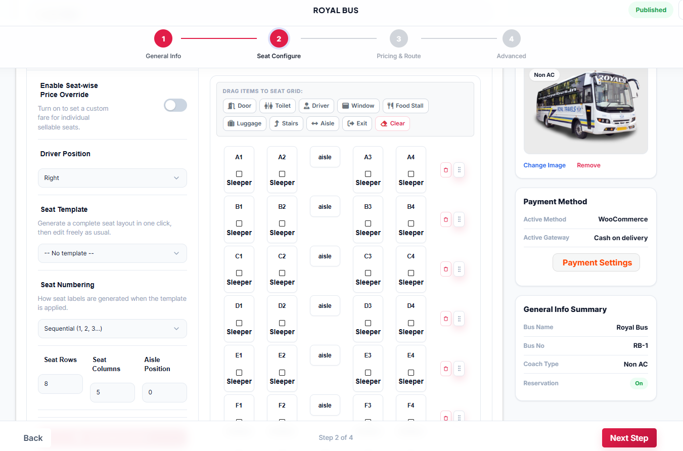
A 2+2 seater coach, a 2+1 sleeper, and a double-decker are not interchangeable grids. The map should mirror the actual arrangement: seat count per row, aisle position, sleeper berths where they exist, and the divider between decks on a multi-level vehicle. Passengers who have travelled that coach type before will notice immediately if the layout is wrong.
2. Unambiguous Status Colours and Labels
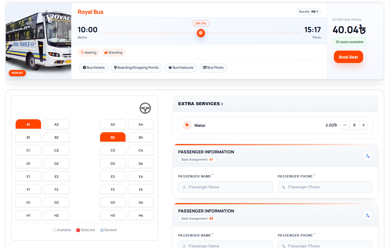
Colour alone is not enough, because a meaningful share of users cannot distinguish certain colour pairs. Pair every status colour with a symbol, pattern, or text label. At minimum, the map should distinguish:
- Available
- Selected by the current passenger
- Booked and paid
- Temporarily held during another checkout
- Blocked by the operator (crew seats, damaged seats, seats reserved offline)
3. Fare Differences per Seat
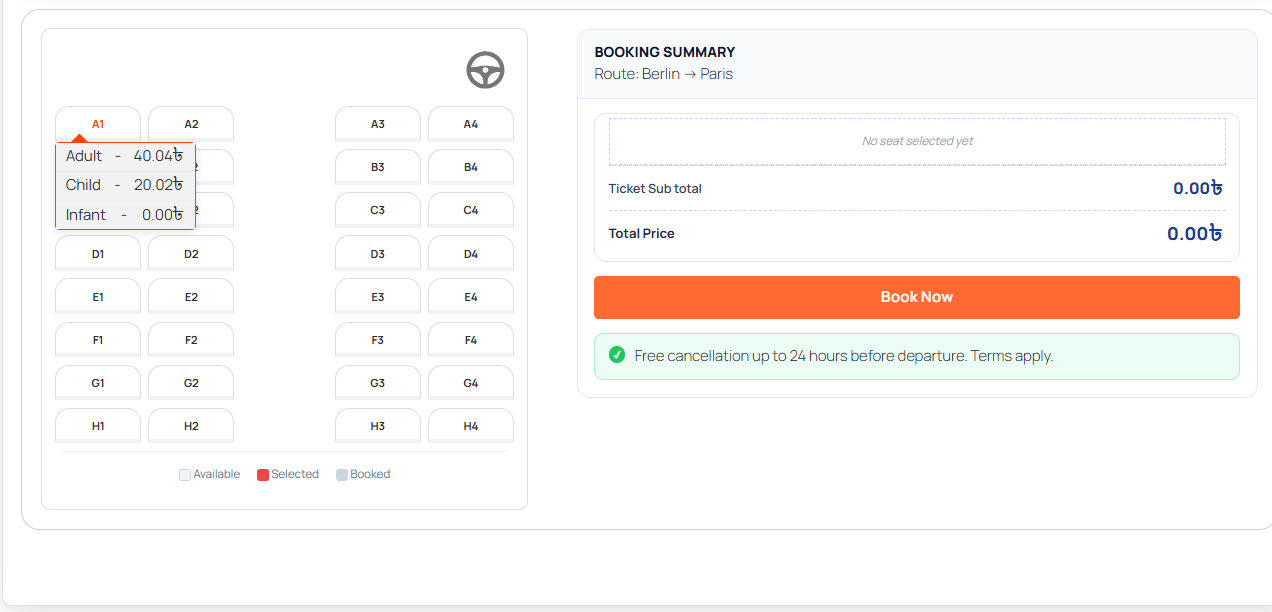
Many operators price the front rows, window seats, or sleeper berths differently. If a seat costs more, the map should say so before the passenger taps it, ideally with the price visible on or beside the seat, and a fare summary that updates as the selection changes.
4. Boarding and Dropping Points
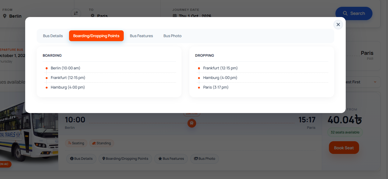
Where a passenger boards often matters more than the seat. Showing boarding-point options alongside the map, and confirming the chosen one in the summary, prevents the classic mismatch of a good seat on the wrong departure.
5. A Clear Path to Payment
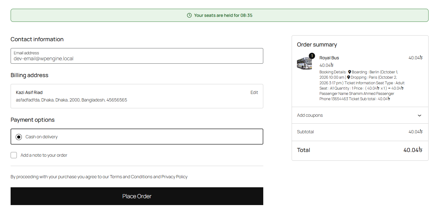
The visualization should carry the passenger forward: selected seats, number of passengers, boarding point, subtotal, any taxes or service fees, and a single obvious action to continue. Ambiguity at this step drives cart abandonment.
6. Mobile-First Rendering
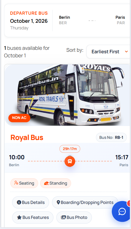
Most bus searches happen on phones. A map that requires pinch-zooming across a wide canvas is functionally broken on a small screen. Test the layout on the narrowest device your audience uses, with tap targets large enough for thumbs.
How the Visualization Fits Into the Booking Flow
It helps to see the map as one stage in a sequence, because problems in the earlier stages surface as confusion on the map:
- Search — origin, destination, date, and passenger count return matching trips.
- Trip selection — the passenger chooses a departure, coach type, and boarding point.
- Visual seat selection — the live map loads, seats are tapped, held, and confirmed.
- Passenger details and payment — the hold converts into a paid booking or expires and releases the seat.
- Ticket delivery — a confirmation, typically a QR-coded ticket, is issued.
Steps three and four must agree with each other in real time. If the map still shows a seat as available after it has been sold, the passenger reaches payment only to be rejected at the worst possible moment for a surprise.
For the step that follows the payment, issuing a QR-coded ticket, there is a separate walkthrough on adding bus ticket QR codes in WordPress.
Assessing Reservation Visualization in Bus Ticket Software
When you evaluate a platform, ask for a live demonstration on a real trip rather than a screenshot. A static marketing image tells you nothing about state changes. Useful checks:
| Check | What you are looking for |
|---|---|
| Two-browser test | Open the same trip in two browsers. Select a seat in one; the other should stop showing it as available. |
| Timeout behaviour | Abandon a seat selection. The held seat should return to available after the hold window ends. |
| Deck support | If you run double-deckers, confirm the map renders separate decks rather than a single flattened grid. |
| Mobile rendering | Load the map on a small phone. No horizontal scrolling, no overlapping labels. |
| Accessibility | Status shown by more than colour; labels readable by screen readers; keyboard-selectable seats. |
| Operator overrides | Can staff block a seat, move a passenger, or release a held seat without breaking the map’s accuracy? |
| Fare display | Seats with different fares are visibly marked, and the summary recalculates as selection changes. |
Pricing, seat limits, and feature tiers vary by vendor and change over time; check current pricing directly on the vendor’s site rather than relying on an older review.
Common Visualization Mistakes and How to Avoid Them
- Static images instead of a live map. If the seat image does not respond to taps, it is not a reservation interface.
- Colour-only status. Add icons or labels so the map works for colour-blind passengers and in bright sunlight.
- Unlabelled seats. Every seat needs an identifier — seat number, berth label, deck prefix — so the passenger can refer to it in a confirmation or a complaint.
- No hold state. Without a visible “being booked” status, two passengers can target the same seat simultaneously.
- Layout drift. Adding a new coach type without updating its map creates mismatches between what is sold and what is on the road.
- Hidden fees. If the map quotes one number and the checkout shows another, trust drops and abandonment rises.
Check out WpBusTicketly now for your bus seat reservation system.
Designing the Visualization for Different Operators
What counts as a good map depends on the fleet and the audience.
A scheduled intercity operator running large coaches needs dense, fast-loading maps with clear deck handling and per-route boarding points. A sleeper service needs berth shapes and orientation head-forward or side-facing because that detail drives the purchase. A minibus or shuttle operator with fixed low fares may only need a simple availability count and a “choose your seat” option for those who care. A small agency selling seats on other operators’ coaches has the hardest version of the problem: inventory it does not control, so the map’s accuracy depends entirely on how promptly its reservations sync. Agencies handling multiple operators’ inventory tend to hit that constraint first — see the notes on automating ticket sales for small travel agencies for how that workflow is usually structured.
In all four cases, the test is the same: can a passenger who has never used your site pick a seat, understand the cost, and pay, on a phone, without help?
Verifying That the Visualization Actually Works
Before going live on a route, run a short rehearsal with staff:
- Book the same trip from two devices at the same time and watch the seat status change on both.
- Abandon one selection and time how long the seat takes to return to available.
- Block a seat as an operator and confirm passengers no longer see it as bookable.
- Complete a booking and check that the seat number shown on the ticket matches the seat selected on the map.
- Repeat the whole flow on the smallest phone screen you support.
If any step fails, the issue is almost always in the sync between inventory and rendering, not in the visual design.
Frequently Asked Questions
Does a seat map need to be interactive to count as a visualization?
For online booking, yes. A static layout image can illustrate capacity, but only an interactive map lets passengers select a specific seat and reflects live availability.
How many seats should be selectable at once?
Enough to match the usual group size on your routes, and never more than the vehicle can legitimately seat together. Set a per-booking cap so a single user cannot hold an entire deck during checkout.
Can a reservation visualization show seats booked offline?
Yes, provided the offline sale is entered into the same inventory the map reads from. Seats sold at a counter or through an agent must be marked as blocked or booked, or the online map will offer seats that are already gone.
What is the biggest cause of inaccurate seat maps?
Lag between a sale being recorded and the map being refreshed. A short, reliably enforced hold window closes most of that gap.
Final Thoughts
Bus ticket reservation visualization is the part of the booking journey a passenger actually judges the site by. Show the real vehicle layout, label every seat state in more than colour, display fares and boarding points where the choice is made, and keep the map in sync with inventory down to the second. Get those four right, and the rest of the booking flow has far less work to do. If you are still choosing the underlying platform rather than refining its visuals, start with the platform-level features that a modern bus ticket software platform must have.